
Introduction
Endless Vue Admin Theme is pure Vue theme, Yes! you read correct, it's No Jquery Vue admin theme including all feature and functionality with ease of integration for your project.Endless theme document will help you to understand Vue from scratch to making perfect real time dream application.
Follow the documentation carefully for solving your issues in minutes, Apart from that if you don't find solution when you following the docs you can raise a support ticket for your issue from pixelstrap.freshdesk.com
DependanciesYes! again No Jquery dependency.
Getting started
Welcome to Vue! Vue helps you build modern applications for the web, mobile, or desktop.
For getting started an Vue application you needs two things as Prerequisites.
Prerequisites
Before you begin, make sure your development environment includes Node and an npm package manager.
Node.js
Download latest version of node.js i.e. node 16 from nodejs.org.
Npm package manager
Vue CLI, and Vue apps depend on features and functionality provided by libraries that are available as npm packages. To download and install npm packages, you must have an npm package manager. This Quick Start uses the npm client command line interface, which is installed with Node.js by default. To check that you have the npm client installed, run npm -v in a terminal/console window.
For better understanding Vue we suggest you to once go through official documentation of Vue from Vuejs.org
Vue setup
Installing Vue CLI
You use the Vue CLI to create projects, generate application and library code, and perform a variety of ongoing development tasks as it is a progressive framework for building user interfaces.
Install the Vue CLI globally.
To install the CLI using npm, open a terminal/console window and enter the following command:
npm install -g @vue/cli
Create Initial application
vue create my-app
Serve Application
cd my-app
npm run serve
Build Application
npm run build
  Options -MultiViews
  RewriteEngine On
  RewriteCond %{REQUEST_FILENAME} !-f
  RewriteRule ^ index.html [QSA,L]
Making Sub-folder on Server
  module.exports = {
    baseUrl: "/endless/",
    publicPath: "/endless/"
  };
base: '/endless/'
npm run build
  Options -MultiViews
  RewriteEngine On
  RewriteBase /endless/
  RewriteCond %{REQUEST_FILENAME} !-f
  RewriteRule ^ index.html [QSA,L]
Endless setup
If you have already download and install node.js and Vue CLI then ignore prerequisites accordingly.
Prerequisites
Node.js
Download latest version of node.js from nodejs.org.
Vue CLI
Install Vue CLI Using:
npm install -g @vue/cli
Setup an Endless theme by
- 1) Download and extract an endless themes from themeforest
- 2) Extract it and then go in to theme folder.
- 3) Import all dependency by installing npm command
- 4) Now you are in stage to successfully run endless using below command:
cd theme
npm install
npm run serve
Folder Structured
Here we represent Vue Folder Structure and Style Customize
- Endless Admin
- node_modules
- public
- src
- components
- commonFiles.vue
- pages
- allFiles.vue
- Assets
- Css
- Fonts
- Images
- Scss
- Video
- data
- alljson files
- router
- index.js
- store
- modules
- index.js
- .eslintrc
- App.vue
- main.js
- components
- babel.config.js
- vue.config.js
- package.json
Theme Customize
Layouts
We have provided a bunch of page layouts and menu layouts that can be implemented with just a options change to body!
For creating your dream layout open customizer by click on setting icon
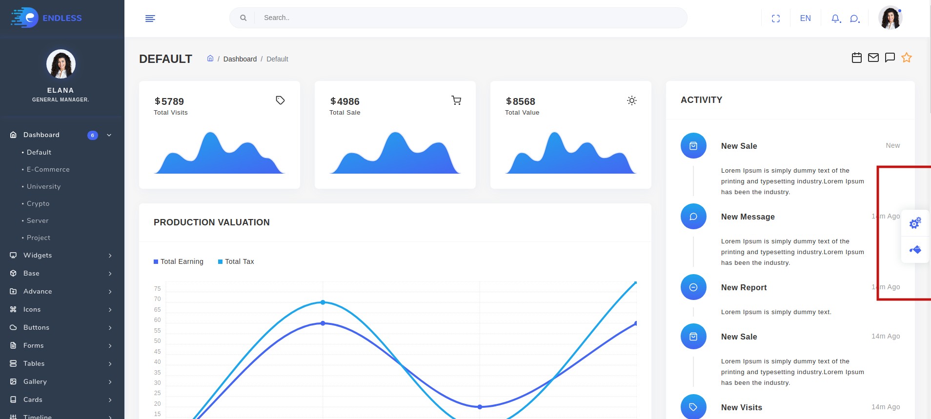
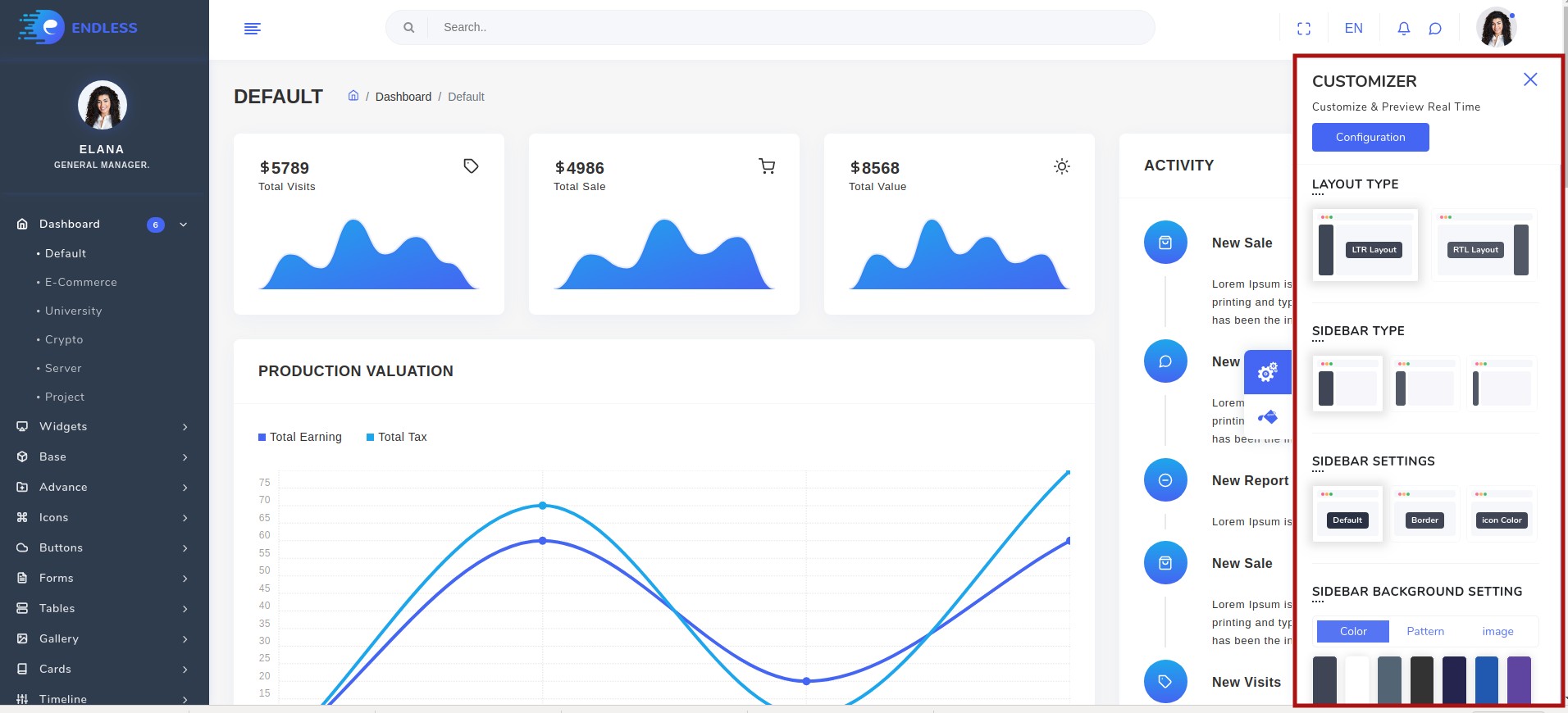
You can change your theme by clicking particular setting
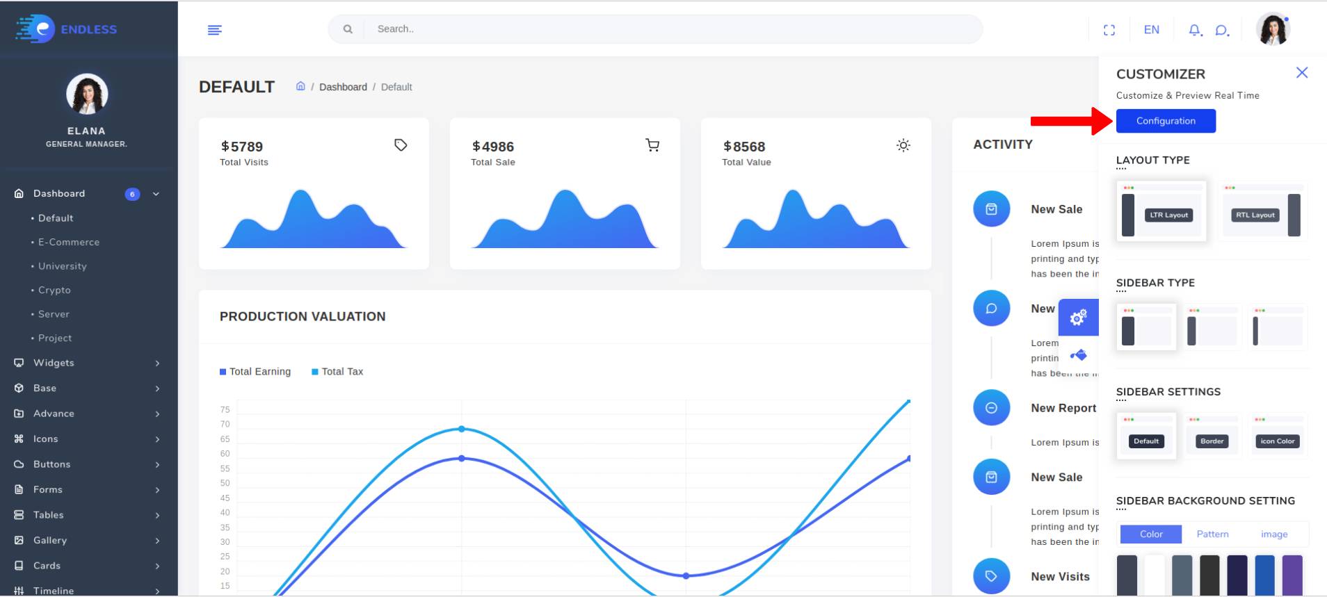
Then you just need to click on configuration button
Configuration popup will be open then just click on copy json button which will copy configuration of theme which you want
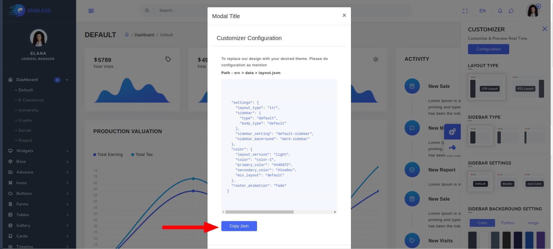
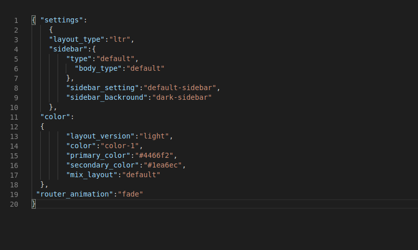
Now go to our theme >> src >> data >> layout.json and then just replace complete layout.json with your new configuration and re-run theme using npm run serve.
Please refer the below table for corresponding classes. it is just for your inforamation you do not need to bother about this it's dynamically take particular classes according to your needs.
| Layout | Options |
|---|---|
| RTL Layout | Attribute: main-theme-layout="rtl" |
| Light layout | class: light-only |
| Dark Page-body | class: dark-body-only |
| Dark Page-body & Sidebar | class: dark-sidebar-body-mix |
| Dark Layout | class: dark-only |
Theme options
We have some inbuilt themes for sidebar that can be switched with just a class change
| Sidebar | Options |
|---|---|
| Default Sidebar layout | Attribute: sidebar-layout="default-sidebar" |
| Bordered Navigation | Attribute: sidebar-layout="border-sidebar" |
| Sidebar icons color | Attribute: sidebar-layout="iconcolor-sidebar" |
| Background Image | class: sidebar-img* |
| Light Sidebar layout | class: light-sidebar |
HTML Structured
Header Structured
General HTML structure is the same throughout the template. Here is the header structure.
                          <div class="page-main-header">

  <div class="main-header-right row">

    <div class="main-header-left d-lg-none">

      ........

    </div>

  <div class="nav-right col p-0">

    ........

  </div>

 </div>

</div>
Content Structured
Generate endless content area using following structure.
                              <div class="page-body">

  <div class="container-fluid">

    ........

  </div>

<!-- Container-fluid starts-->

<div class="container-fluid">

    .......

</div>

  <!-- Container-fluid Ends-->

</div>
Footer Structured
Footer structure to complete endless structure.
                              <footer class="footer">


  <div class="container-fluid">

    .............

  </div>


</footer>
Basic UI Elements
                                <button class="btn btn-primary" type="button" data-bs-toggle="tooltip"
                                  title="btn btn-primary">Primary Button</button>

<button class="btn btn-secondary" type="button" data-bs-toggle="tooltip"
title="btn btn-secondary">Secondary Button</button>

<button class="btn btn-success" type="button" data-bs-toggle="tooltip"
title="btn btn-success">Success Button</button>

<button class="btn btn-info" type="button" data-bs-toggle="tooltip" title="btn btn-info">Info
Button</button>

<button class="btn btn-warning" type="button" data-bs-toggle="tooltip"
title="btn btn-warning">Warning Button</button>

<button class="btn btn-danger" type="button" data-bs-toggle="tooltip"
title="btn btn-danger">Danger Button</button>

<button class="btn btn-light" type="button" data-bs-toggle="tooltip" title="btn btn-light">Light Button</button>
                                <span class="badge badge-primary">Primary</span>

<span class="badge badge-secondary">Secondary</span>

<span class="badge badge-success">Success</span>

<span class="badge badge-info">Info</span>

<span class="badge badge-warning">Warning</span>

<span class="badge badge-danger">Danger</span>

<span class="badge badge-light">Light</span>

<span class="badge badge-dark tag-pills-sm-mb">Dark</span>
                                <div class="progress">

  <div class="progress-bar" role="progressbar" aria-valuenow="0" aria-valuemin="0" aria-valuemax="100">
</div>

    <div class="progress">
<div class="progress-bar bg-primary" role="progressbar" style="width: 25%" aria-valuenow="25" aria-valuemin="0" aria-valuemax="100">
</div>

      <div class="progress">
<div class="progress-bar bg-secondary" role="progressbar" style="width: 50%" aria-valuenow="50" aria-valuemin="0" aria-valuemax="100">
</div>

    <div class="progress">
<div class="progress-bar bg-success" role="progressbar" style="width: 75%" aria-valuenow="75" aria-valuemin="0" aria-valuemax="100">
</div>

  <div class="progress">

<div class="progress-bar bg-info" role="progressbar" style="width: 100%" aria-valuenow="100" aria-valuemin="0" aria-valuemax="100">
</div>
                                <div class="alert alert-primary dark" role="alert">This is a info alert—check it out!</div>

  <div class="alert alert-secondary dark" role="alert">This is a light alert—check it out!</div>

    <div class="alert alert-success dark" role="alert">This is a success alert—check it out!</div>

      <div class="alert alert-info dark" role="alert">This is a danger alert—check it out!</div>

      <div class="alert alert-warning dark" role="alert">This is a secondary alert—check it out!</div>

    <div class="alert alert-danger dark" role="alert">This is a warning alert—check it out!</div>

  <div class="alert alert-light dark" role="alert">This is a dark alert—check it out!</div>

<div class="alert alert-dark dark" role="alert">This is a dark alert—check it out!</div>
<template><button class="example-popover btn btn-primary" type="button" data-container="body"
data-bs-toggle="popover" data-bs-placement="top" title="Popover title"
data-bs-content="Vivamus sagittis lacus vel augue laoreet rutrum faucibus.">Popover on
top</button></template><script>import { Popover } from 'bootstrap/dist/js/bootstrap.esm.min.js'export default {mounted() {new Popover(document.body, {selector: "[data-bs-toggle='popover']", }) } }</script><template><div> <button class="example-popover btn btn-primary" type="button" data-container="body" data-bs-toggle="tooltip"
data-bs-placement="top" title="Popover title"> Hover Me
</button></div></template><script>import { Tooltip } from 'bootstrap/dist/js/bootstrap.esm.min.js'export default { mounted() {new Tooltip(document.body, { selector: "[data-bs-toggle='tooltip']", }), } },</script><template><div><div class="dropdown">
<button class="dropbtn btn-primary" type="button">Dropdown Button <span><i
                              class="icofont icofont-arrow-down"></i></span></button>
<div class="dropdown-content"><a href="#">Action</a><a href="#">Another Action</a><a href="#">Something
Else Here</a></div></div></template>Lorem Ipsum is simply dummy text of the printing and typesetting industry. Lorem Ipsum has been the industry's standard dummy text ever since the 1500s, when an unknown printer took a galley of type and scrambled it to make a type specimen book. It has survived not only five centuries, but also the leap into electronic typesetting,remaining essentially unchanged. It was popularised in the 1960s with the release of Letraset sheets containing Lorem Ipsum passages,and more recently with desktop publishing software like Aldus PageMaker including versions of Lorem Ipsum
Lorem Ipsum is simply dummy text of the printing and typesetting industry. Lorem Ipsum has been the industry's standard dummy text ever since the 1500s, when an unknown printer took a galley of type and scrambled it to make a type specimen book. It has survived not only five centuries, but also the leap into electronic typesetting, remaining essentially unchanged. It was popularised in the 1960s with the release of Letraset sheets containing Lorem Ipsum passages, and more recently with desktop publishing software like Aldus PageMaker including versions of Lorem Ipsum
Lorem Ipsum is simply dummy text of the printing and typesetting industry. Lorem Ipsum has been the industry's standard dummy text ever since the 1500s, when an unknown printer took a galley of type and scrambled it to make a type specimen book. It has survived not only five centuries, but also the leap into electronic typesetting,remaining essentially unchanged. It was popularised in the 1960s with the release of Letraset sheets containing Lorem Ipsum passages,and more recently with desktop publishing software like Aldus PageMaker including versions of Lorem Ipsum
<ul class="nav nav-tabs" id="myTab" role="tablist"><li class="nav-item"><a class="nav-link active" id="home-tab" data-bs-toggle="tab" href="#home" role="tab"
aria-controls="home" aria-selected="true">Home</a></li><li class="nav-item dropdown"><a class="nav-link dropdown-toggle" id="dropdownMenuButton"
data-bs-toggle="dropdown" href="#" role="button" aria-expanded="false">Dropdown</a>
<div class="dropdown-menu" aria-labelledby="dropdownMenuButton"><a class="dropdown-item"
                                id="profile-tab" data-bs-toggle="tab" href="#profile" role="tab" aria-controls="profile"
                                aria-selected="false">Action</a><a class="dropdown-item" href="#">Another action</a><a
                                class="dropdown-item" href="#">Something else here</a>
<div class="dropdown-divider"></div><a class="dropdown-item" href="#">Separated link</a>
</div>
</li>
<li class="nav-item"><a class="nav-link" id="profile-tabs" data-bs-toggle="tab" href="#profile" role="tab"
                                aria-controls="profile" aria-selected="false">Profile</a></li>
<li class="nav-item"><a class="nav-link" id="contact-tab" data-bs-toggle="tab" href="#contact" role="tab"
                                aria-controls="contact" aria-selected="false">Contact</a></li>
</ul>
<div class="tab-content" id="myTabContent">
<div class="tab-pane fade show active" id="home" role="tabpanel" aria-labelledby="home-tab">
<p class="mb-0 m-t-30">Lorem Ipsum is simply dummy text of the printing and typesetting industry. Lorem
                                Ipsum has been the industry's standard dummy text ever since the 1500s, when an unknown printer took a
                                galley of type and scrambled it to make a type specimen book. It has survived not only five centuries,
                                but also the leap into electronic typesetting, remaining essentially unchanged. It was popularised in
                                the 1960s with the release of Letraset sheets containing Lorem Ipsum passages, and more recently with
                                desktop publishing software like Aldus PageMaker including versions of Lorem Ipsum</p>
</div >
<div class="tab-pane fade" id="profile" role="tabpanel" aria-labelledby="profile-tab" >
<p class="mb-0 m-t-30">Lorem Ipsum is simply dummy text of the printing and typesetting industry. Lorem
                                Ipsum has been the industry's standard dummy text ever since the 1500s, when an unknown printer took a
                                galley of type and scrambled it to make a type specimen book. It has survived not only five centuries,
                                but also the leap into electronic typesetting, remaining essentially unchanged. It was popularised in
                                the 1960s with the release of Letraset sheets containing Lorem Ipsum passages, and more recently with
                                desktop publishing software like Aldus PageMaker including versions of Lorem Ipsum</p>
</div >
<div class="tab-pane fade" id="contact" role="tabpanel" aria-labelledby="contact-tab">
<p class="mb-0 m-t-30">Lorem Ipsum is simply dummy text of the printing and typesetting industry. Lorem
                                Ipsum has been the industry's standard dummy text ever since the 1500s, when an unknown printer took a
                                galley of type and scrambled it to make a type specimen book. It has survived not only five centuries,
                                but also the leap into electronic typesetting, remaining essentially unchanged. It was popularised in
                                the 1960s with the release of Letraset sheets containing Lorem Ipsum passages, and more recently with
                                desktop publishing software like Aldus PageMaker including versions of Lorem Ipsum</p>
</div >
</div></template><div class="default-according accordion" id="accordion"><div class="card" v-for="(item, index) in basic" :key="index"><div class="card-header" id="headingOne"><h5 class="mb-0"><button class="btn btn-link" data-bs-toggle="collapse" @click="toggleAccordion(index)"
:data-bs-target="'#' + item.id" aria-expanded="true" aria-controls="collapseOne"
v-html="item.title"></button></h5></div><div v-if="item.isActive" :id="item.id" aria-labelledby="headingOne" data-bs-parent="#accordion"><div class="card-body">Anim pariatur cliche reprehenderit, enim eiusmod high life accusamus terry
richardson ad squid. 3 wolf moon officia aute, non cupidatat skateboard dolor brunch. Food truck
quinoa nesciunt laborum eiusmod. Brunch 3 wolf moon tempor, sunt aliqua put a bird on it squid
single-origin coffee nulla assumenda shoreditch et.</div></div></div></div><script>import { mapState } from "vuex";export default {computed: { ...mapState({basic: state => state.base.data,})},methods: {toggleAccordion(index) {this.basic[index].isActive = !this.basic[index].isActive;this.closeOtherAccordions(index);},closeOtherAccordions(currentIndex) {this.basic.forEach((item, index) => { if (index !== currentIndex) { item.isActive = false; } });},},},</script>{"basic": [ {"id": "collapseOne", "isActive": true,"title": "Collapsible Group Item #<span class='digits'>1</span>","desc": "Anim pariatur cliche reprehenderit, enim eiusmod high life accusamus terry richardson ad squid. 3 wolf moon officia aute, non cupidatat skateboard dolor brunch. Food truck quinoa nesciunt laborum eiusmod. Brunch 3 wolf moon tempor, sunt aliqua put a bird on it squid single-origin coffee nulla assumenda shoreditch et."},{ "id": "collapseTwo", "isActive": false, "title": "Collapsible Group Item #<span class='digits'>2/span>", "desc": "Anim pariatur cliche reprehenderit, enim eiusmod high life accusamus terry richardson ad squid. 3 wolf moon officia aute, non cupidatat skateboard dolor brunch. Food truck quinoa nesciunt laborum eiusmod. Brunch 3 wolf moon tempor, sunt aliqua put a bird on it squid single-origin coffee nulla assumenda shoreditch et."}{ "id": "collapseThree", "isActive": false, "title": "Collapsible Group Item #span class='digits'>3</span>", "desc": "Anim pariatur cliche reprehenderit, enim eiusmod high life accusamus terry richardson ad squid. 3 wolf moon officia aute, non cupidatat skateboard dolor brunch. Food truck quinoa nesciunt laborum eiusmod. Brunch 3 wolf moon tempor, sunt aliqua put a bird on it squid single-origin coffee nulla assumenda shoreditch et."},],},import data from '../../data/base.json'const state = { data : data.basic,} const getters = {}const mutations = {},const actions = { } export default { namespaced: true, state,getters,actions, mutations }Larger shadow
Larger shadow
Regular shadow
Regular shadow
small shadow
Small shadow
                                  <div class="shadow-lg p-25 shadow-showcase text-center">

    <h6 class="m-0 f-18">Larger shadow</h5>

  </div>

    <h6 class="sub-title mb-5 mt-5">Regular shadow</h6>

  <div class="shadow shadow-showcase p-25 text-center">

    <h6 class="m-0 f-18">Regular shadow</h5>

  </div>

    <h6 class="sub-title mb-5 mt-5">small shadow</h6>

  <div class="shadow-sm shadow-showcase p-25 text-center mb-5">

    <h6 class="m-0 f-18">Small shadow</h5>

  </div>
Components
Advance UI Elements
This is an Vue wrapper library for the Perfect Scrollbar. To use this library you should get familiar with the Perfect Scrollbar documentation as well since this documentation only explains details specific to this wrapper.
Installing and usage
npm i vue3-perfect-scrollbar
import { createApp } from 'vue'import 'vue3-perfect-scrollbar/dist/vue3-perfect-scrollbar.min.css'
import PerfectScrollbar from 'vue3-perfect-scrollbar'createApp(App).use(PerfectScrollbar).mount('#app')<template><div><perfect-scrollbar class="scroll-area" v-once :settings="settings">
<img src="../../assets/images/banner/3.jpg" alt="girl" width="800" height="600"
</perfect-scrollbar></div></template><script>export default { data() { return { settings: { maxScrollbarLength: 60 }, } },}</script>Installing and usage
npm i vue3-tour
import { createApp } from 'vue'import 'vue3-tour/dist/vue3-tour.css'import Vue3Tour from 'vue3-tour'createApp(App).use(Vue3Tour).mount('#app')<template><div> <v-tour name="myTour" :steps="steps" :options="tourOptions"></v-tour>
</div></template><script>export default { data () { return { tourOptions: {
useKeyboardNavigation: true,
labels: {
buttonSkip: 'Skip',
buttonPrevious: 'Back',
buttonNext: 'Next',
buttonStop: 'Done'
} }, steps: [ { target: '#profile-tour',
content: 'This is Profile image'
}, { target: '#update-profile-tour',
content: 'Change Profile image here'
} ] } }, mounted: function () { this.$tours['myTour'].start()
}}</script>Installing and usage
npm i vue-star-rating
<template><div> <star-rating :show-rating="false" :star-size="20" :max-rating="10"
@update:rating="rating = $event"></star-rating>
</div></template><script>import StarRating from 'vue-star-rating';export default { components: { StarRating, }, data() { return { rating: "0", } } methods:{ currentRating(){ return this.rating
} }}</script>Installing and usage
<template><div> <nav aria-label="Page navigation example"> < ul class="pagination pagination-primary" > <li class="page-item"><a class="page-link" href="#"> Previous</a></li> <li class="page-item"><a class="page-link" href="#">1</a></li> <li class="page-item"><a class="page-link" href="#">2</a></li> <li class="page-item"><a class="page-link" href="#">3</a></li> <li class="page-item"><a class="page-link" href="#">Next</a></li> </ul ></nav></div></template><script>export default { }</script>Installing and usage
npm i vue-sweetalert2
import { createApp } from 'vue'import 'sweetalert2/dist/sweetalert2.min.css';import VueSweetalert2 from 'vue-sweetalert2';createApp(App).use(VueSweetalert2).mount('#app')<template><div> <button class="btn btn-primary sweet-1" type="button" v-on:click="basic">Basic</button>
</div></template><script>export default { methods:{ basic:function(){ this.$swal({ title:'Hello world!' }); } } }</script>Installing and usage
npm install vue-slider-component@next --save
<template><div> <VueSlider v-model="one.value" :marks="one.data" :tooltip="'always'"
:tooltip-placement="'top'" ></VueSlider>
</div></template><script>import VueSlider from 'vue-slider-component'import 'vue-slider-component/theme/antd.css'export default {data () {return {one:{value:5,data: [10, 100]} } } }</script>Installing and usage
npm i vue-cropperjs
<template><div> <vue-cropper ref='cropper' :crop="cropImage"> </vue-cropper>
</div></template><script>import VueCropper from 'vue-cropperjs';import 'cropperjs/dist/cropper.css';export default { data () {return {cropImg: '', } } },components: { VueCropper,},mounted(){ this.imageData = this.$refs.cropper.getData();},</script>Installing and usage
npm i dropzone-vue
<template><div> <DropZone :maxFileSize="Number(60000000)" :uploadOnDrop="true"
:dropzoneMessageClassName="customClass" :maxFiles="1">
</DropZone></div></template><script>import DropZone from "dropzone-vue";export default { data () {return { } } },components: { DropZone}</script><style scoped>@import 'dropzone-vue/dist/dropzone-vue.common.css';</style>Forms
Installing and usage
npm i @vuepic/vue-datepicker
import { createApp } from 'vue'import '@vuepic/vue-datepicker/dist/main.css'import Datepicker from '@vuepic/vue-datepicker';createApp(App).component('Datepicker', Datepicker).mount('#app')<template><div> <datepicker class="datepicker-here digits" v-model="date"
:format="format" />
</div></template><script>import { ref, onMounted, computed } from 'vue';export default {setup(){ const date = ref(); const format = (date) => { const day = date.getDate(); const month = date.getMonth() + 1; const year = date.getFullYear();
return ` ${day}/${month}/${year}`;
}, return { date format } }},</script>Installing and usage
npm i vue-multiselect
import { createApp } from 'vue'import "vue-multiselect/dist/vue-multiselect.css"import Multiselect from 'vue-multiselect'createApp(App).component('multiselect', Multiselect).mount('#app')<template><div> <multiselect v-model="singleValue" :options="options" label="name" :searchable="false"
:close-on-select="false" :show-labels="false" placeholder="Pick a value"/>
</div></template><script>export default {data(){ return{ singleValue:"" multiValue: [ { name: 'Alabama', code: '1' }, { code: 2, name: 'Wyoming' } ], }},</script>Installing and usage
npm i vue3-simple-typeahead
<import { createApp } from 'vue'>import 'vue3-simple-typeahead/dist/vue3-simple-typeahead.css'; createApp(App).use(SimpleTypeahead).mount('#app')<template><div> <vue3-simple-typeahead :items="list" class="form-control typeahead form-control"
:placeholder="options.placeholder" @onInput="onInput" @onBlur="onBlur"
:minInputLength="options.minInputLength" /></template><script>import VueBootstrapTypeahead from "vue-bootstrap-typeahead";export default { created() { this.listFiltered = this.list; this.listFiltered1 = this.list1; }data(){ return{ options: { placeholder: 'States of USA', minInputLength: 1, }, list: [ 'alabama',
'alaska',
'arizona',
'arkansas',
'california',
'colorado',
'connecticut',
'delaware',
'florida',
'georgia',
'hawaii',
'idaho',
'illinois',
'indiana',
'iowa',
'kansas',
'kentucky',
'louisiana',
'maine',
'maryland',
'massachusetts',
'michigan',
'minnesota',
'mississippi',
'missouri',
'montana',
'nebraska',
'nevada',
'new hampshire',
'new jersey',
'new mexico',
'new york',
'north carolina',
'north dakota',
'ohio',
'oklahoma',
'oregon',
'pennsylvania',
'rhode island',
'south carolina',
'south dakota',
'tennessee',
'texas',
'utah',
'vermont',
'virginia',
'washington',
'west virginia',
'wisconsin',
'wyoming'
] }}, methods: { onInput(event) { this.listFiltered = event.items; } onBlur(event) { this.listFiltered = event.items; },}</script>Tables
Installing and usage
For installing bootstrap in your project use
npm i bootstrap
import "bootstrap/dist/css/bootstrap.min.css"import "bootstrap"import "bootstrap/dist/js/bootstrap.min.js"<template><div class="col-sm-12"> <div class="card">
<div class="card-header"><h5>Basic Table</h5> </div><div class="table-responsive custom-scrollbar"><table class="table"><thead><tr><th scope="col"> # <th><th scope="col"> First Name <th><th scope="col"> Last Name <th><th scope="col"> Username <th><th scope="col">Role<th><th scope="col"> Country <th></tr></thead><tbody><tr v-for="(item, index) in items" :key="index"><th scope="row">{{ item.no }}< /th> <td> {{ item.first_name }} < /td><td> {{ item.last_name }} < /td><td> {{ item.username }} < /td><td> {{ item.role }} < /td><td> {{ item.country }} < /td></tr></tbody></table></div></div></div></template><script>export default { data(){ return{ items: [ { no:1, first_name:'Alexander', last_name:'Orton', username:'@mdorton', role:'Admin', country:'USA' },
{ no:2, first_name:'John Deo', last_name:'Deo', username:'@johndeo', role:'User', country:'USA' },
{ no:3, first_name:'Randy Orton', last_name:'the Bird', username:'@twitter', role:'admin', country:'UK' },
{ no:4, first_name:'Randy Mark', last_name:'Ottandy', username:'@mdothe', role:'user', country:'AUS' },
{ no:5, first_name:'Ram Jacob', last_name:'Thornton', username:'@twitter', role:'admin', country:'IND' }
] }},</script>Charts
Installing and usage
npm i vue-google-charts
<template><div> <GChart class="chart-overflow" id="pie-chart1" type="PieChart" :data="pie_chart.chartData_1"/></template><script>import { GChart } from 'vue-google-charts'data(){ return{ chartsLib: null, pie_chart: { chartData_1: [ ['Task', 'Hours per Day'],
['Work', 5],
['Eat', 10],
['Commute', 15], ['Watch TV', 20], ['Sleep', 25]
] } }},components: { GChart}</script>Installing and usage
npm i vue-chartist
<template><div> <chartist class="ct-6 flot-chart-container" ratio="ct-major-second" type="Line" :data="chart1.data" :options="chart1.options"> </chartist></template><script>import * as Chartist from 'chartist';export default {data(){ return{ chart1 : { data: { labels: ['1', '2', '3', '4', '5', '6', '7', '8', '9', '10', '11', '12'],
series: [ [12, 9, 7, 8, 5, 4, 6, 2, 3, 3, 4, 6],
[4, 5, 3, 7, 3, 5, 5, 3, 4, 4, 5, 5],
[5, 3, 4, 5, 6, 3, 3, 4, 5, 6, 3, 4],
[3, 4, 5, 6, 7, 6, 4, 5, 6, 7, 6, 3]
] }, options: { low: 0, showArea: false, fullWidth: true, } },}},components: { Chartist}}</script>Map
Installing and usage
npm i vue3-google-map
<template><div> <GmapMap api-key="AIzaSyDGCQvcXUsXwCdYArPXo72dLZ31WS3WQRw" :center="{lat:20.5937, lng:78.9629}" :zoom="12" style="width: auto; height: 500px">
</GmapMap>
</template><script>import { GoogleMap, } from "vue3-google-map";export default { data(){ return{ } }, components: { GoogleMap }}</script>Installing and usage
npm i @vue-leaflet/vue-leaflet
<template><div> <l-map :zoom="simple.zoom" :center="simple.center" style="height: 500px">
<l-tile-layer :url="simple.url"></l-tile-layer>
</l-map>
</template><script>import { LMap, LMarker, LPopup, LTileLayer, LPolygon } from '@vue-leaflet/vue-leaflet'
import "leaflet/dist/leaflet.css";export default { data(){ return{ simple:{ zoom:5, center: [49.439557, 234.558105],
url:'http://{s}.tile.osm.org/{z}/{x}/{y}.png',
} } }, components: { LMap LMarker LPopup LTileLayer Polygon }}</script>Editors
Installing and usage
npm i vue3-quill
import { createApp } from 'vue'
import { quillEditor } from "vue3-quill";
createApp(App)
.use(quillEditor)
.mount('#app')
<template><div> <quill-editor v-model:value="state.content" :options="state.editorOption" @blur="onEditorBlur($event)"
@focus="onEditorFocus($event)" @ready="onEditorReady($event)" @change="onEditorChange($event)" />
</div></template><script>import { reactive } from 'vue'export default { setup() { const state = reactive({ content: "<h1>Some initial content</h1>"
_content: '',
editorOption: {
placeholder: 'core',
}
disabled: false
}) const onEditorChange = ({ html, }) => { state._content = html } setTimeout(() => { state.disabled = true }, 2000) return { state, onEditorBlur, onEditorFocus, onEditorReady, onEditorChange }
}, }</script>Installing and usage
npm i @ckeditor/ckeditor5-vue
<template><div> <ckeditor :editor="editor" v-model="editorData"></ckeditor>
</div></template><script>import CKEditor from '@ckeditor/ckeditor5-vue';import ClassicEditor from '@ckeditor/ckeditor5-build-classic';export default { data(){ return{ editor: ClassicEditor, editorData: '<p>Lorem Ipsum is simply dummy text</p>',
} }, components: { ckeditor: CKEditor.component }}</script>Apps
E-commerce
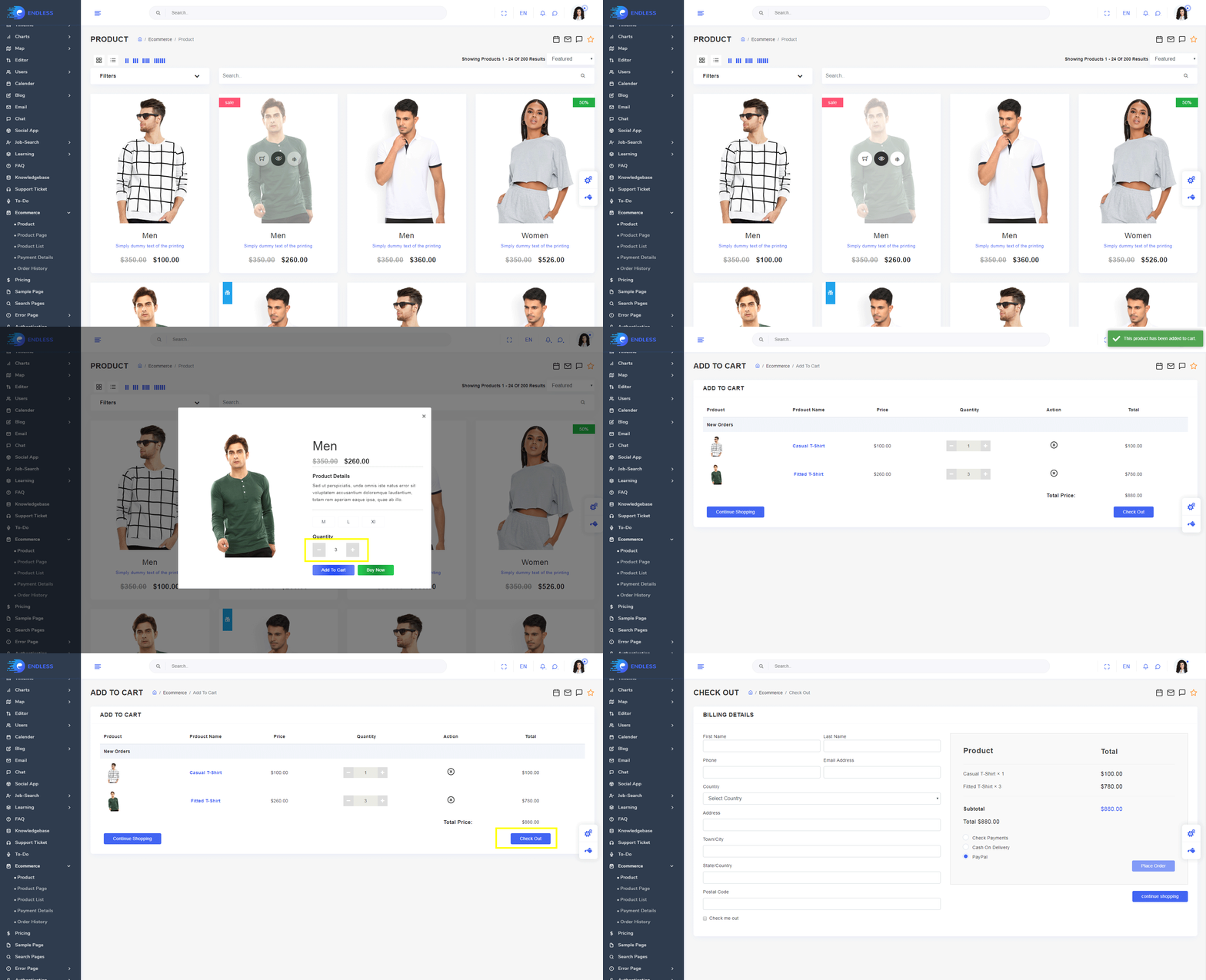
You can directly use complete E-commerce app to manage your E-commerce with readymade functionality of Add to cart,Quickview, and Checkout with Stripe as well as Paypal. Apart from that if you want it to use it in your frontend application then you just need to change your json with your API data and you get complete workable E-commerce for your frontend.
Chat
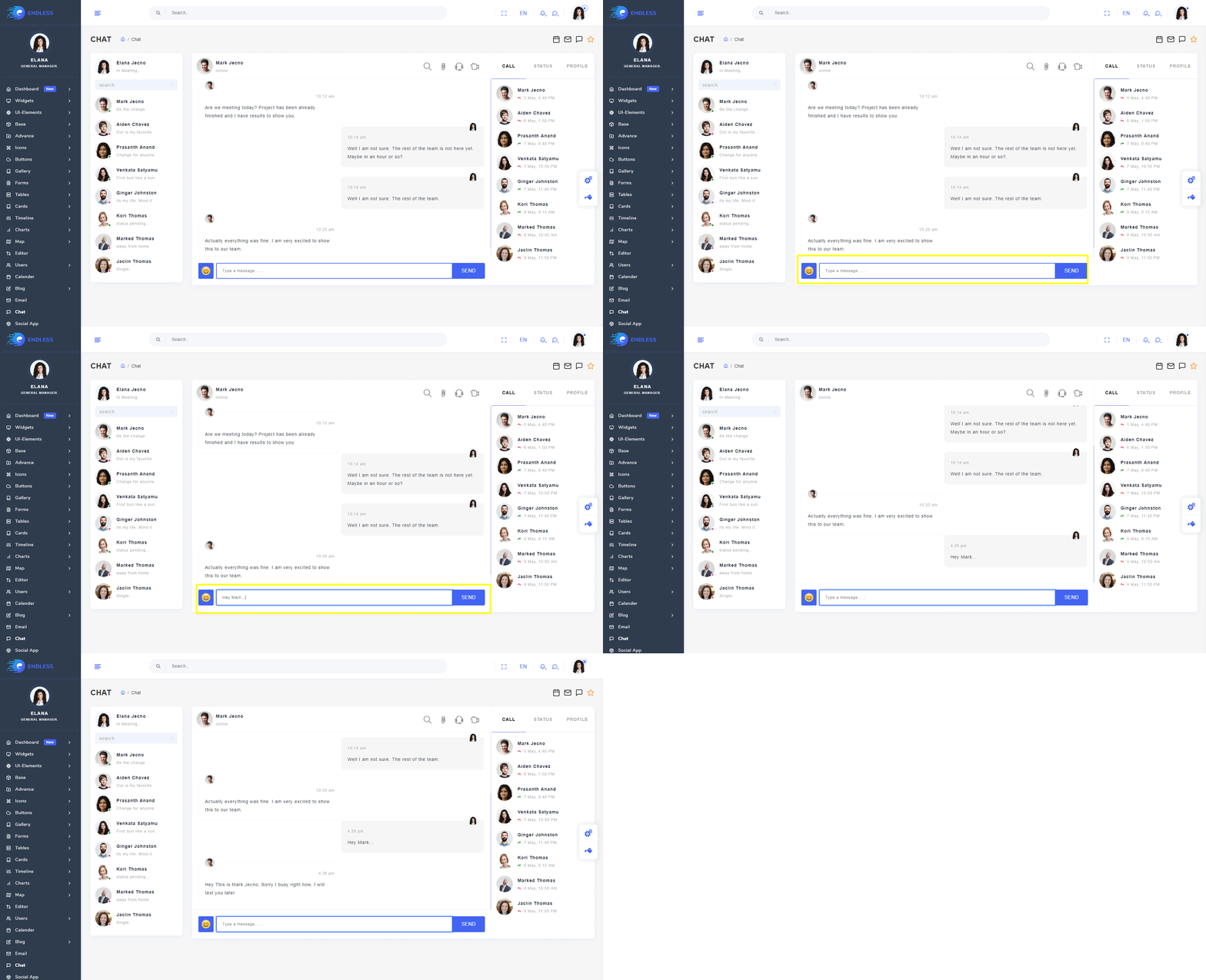
In Chat application we provide complete chat designing with basic feature like chat with a people.
To-D0
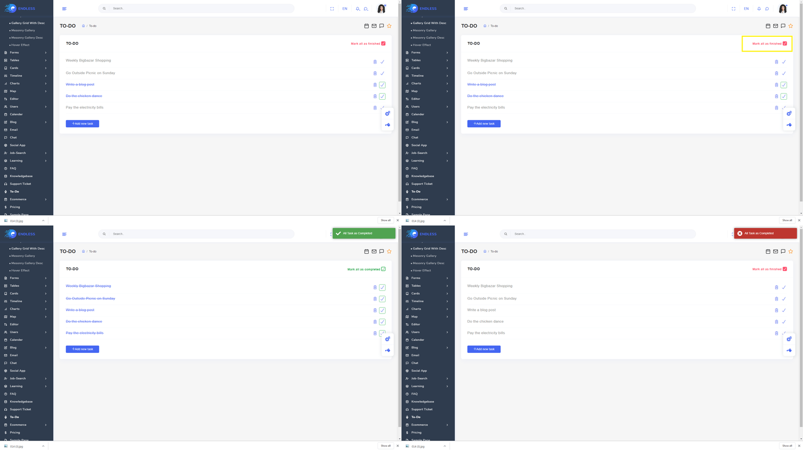
Now it's time to Decrease your burden by listing your daily task in our To-do app and feel relax.
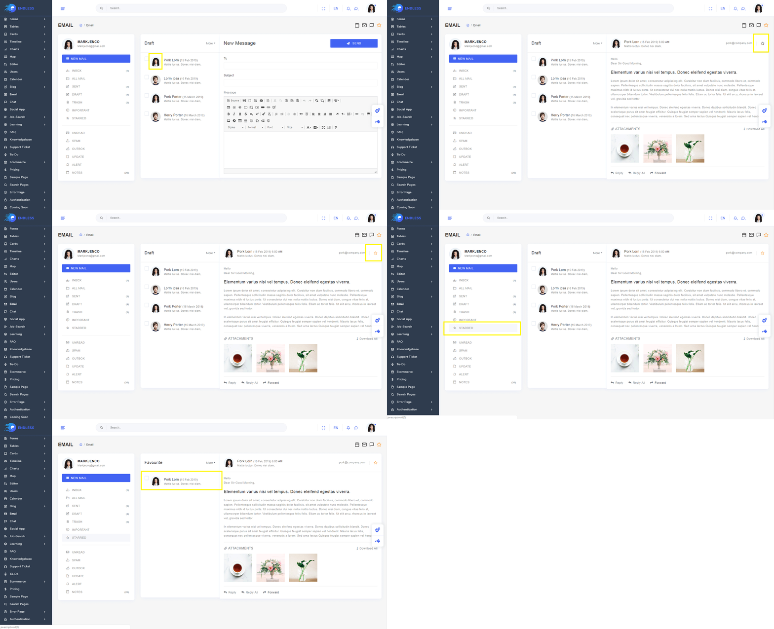
Use our Email application design to build complete email app
Bookmark
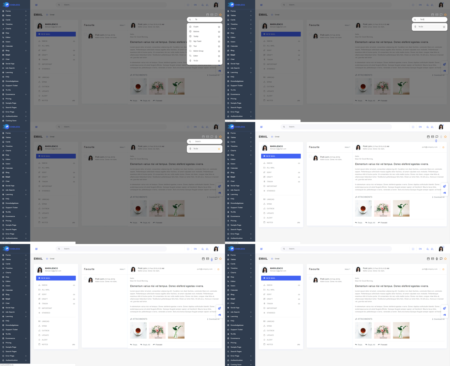
You can Bookmark your Favioute application and pages using bookmark app so you can reach to your favioute app quickly.
Calender
Installing and usage
npm i vue-simple-calendar
<template><div> <calendar-view :show-date="showDate" class="theme-default holiday-us-traditional holiday-us-official">
<calendar-view-header slot="header" slot-scope="t" :header-props="t.headerProps" @input="setShowDate" />
</calendar-view></div></template><script>import { CalendarView, CalendarViewHeader, CalendarMathMixin} from "vue-simple-calendar";
import Datepicker from 'vuejs-datepicker';export default { data(){ return{ showDate: new Date() } }, components: { CalendarView, CalendarViewHeader, Datepicker }, methods: { setShowDate(d) { this.showDate = d; } }}</script>Others
There are many others application in endless which is help you in improve your knowledge and solve your issues.
Thank You
Basically Our team will support inApart from that, if you needs any extra / customization work then also you can get in touch with our experts by raising ticket to help you in customize with affordable extra budget.